Safety Blue

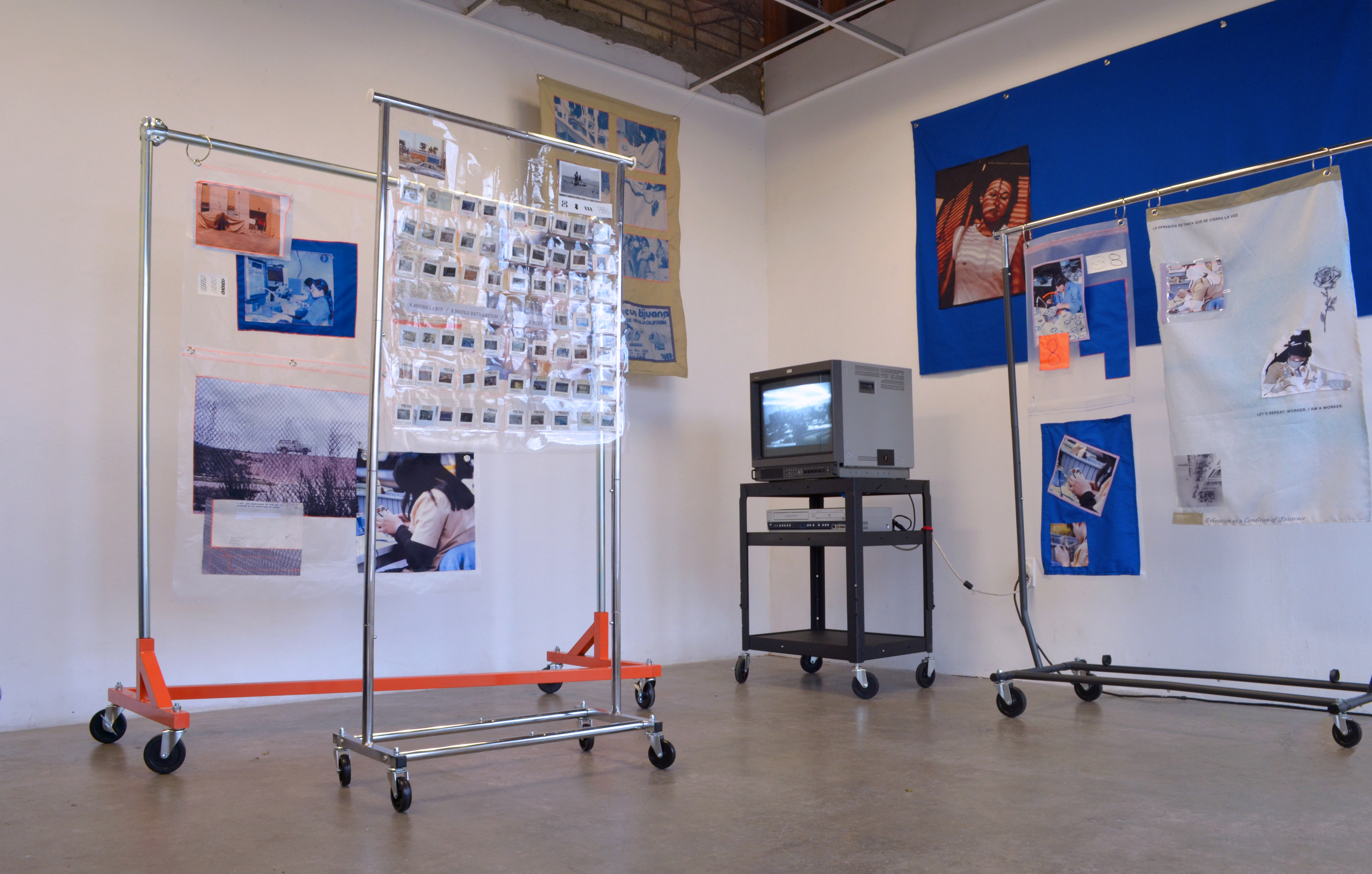
Safety Blue is a series of encounters, an exercise in enunciation, and an access point to thread connections between past and present histories regarding women, labor, and oppression. The heart of the project is a historical archive on the working conditions of women workers in the maquiladoras of northern Mexico, particularly in Tijuana and Ciudad Juarez. The archive is an index of work documents from the artist’s parents (Norma Iglesias and Jorge Carrillo) based on research that was conducted in the early 1980s from an anthropological and sociological perspective and constitutes pioneer work in its field. Through different mediums and readings, Safety Blue links and reinterprets the voices and histories of women maquiladora workers as well as the experiences of the artist’s mother. From this range of subjectivities, we are urged to rethink and contest how the bodies of Latin-American women workers continue to be shaped by labor, productivity, and capital; how these bodies have become political territories in dispute, crossed by colonization and marked by the territories they inhabit. Despite these conditions, the project is fueled by the recognition and recuperation

Exhibition at Human Resources 2020


Express, flex, reflex

1. Dental plaster, metal, rubber bands, LED lighting.
2. Shower Curtain

Continuation of work for Flat Affect 


Cortina de baño >>> Atletas de producción capitalista


Plano afectivo | Flat Affect

Andrea Carrillo Iglesias (1986, Tijuana, Mexico) presents Flat Affect (Plano afectivo) an exhibition that explores the ethics and aesthetics of empathy through the design and production of smiles. Based on concepts and dental design techniques from smile design, the work carries a speculative methodology, a sort of future archeology that delves into the ruins of the present. The narrative is set against a landscape in which emotion and empathy become a technological extension, and where the body is a quantifiable enterprise molded by hyperreality.

Carrillo’s work mainly crosses two parallel lines of thought: the leading role of digital images in the medical industry —not only as representations, but as tools that operate onto reality—, as well as the capitalist dynamics that transform, among other things, body and healthcare into commodified goods.

Jens Eder and Charlotte Klank give us an account of the way images operate upon the world in Image Operations. Visual Media and Political Conflict (2017, Manchester University Press), and the three ways in which they actively infer from the world: As part of a machine operation, as a motivation for a social group to take action, and as a means of manipulation of affects and thoughts.

Regarding the research that lies at the center of Flat Affect, these operative images are found on multiple levels of the medical industry, specifically in the dental health services, aiding to construct the perception of the body and its health, while also participating in the construction of desire. Through her work, Carrillo triggers the agency of the medical / aesthetic industry by setting it against a technological reality such as Faception. A company that claims to predict, reveal and catalog someone’s personality solely through an image. Corrective prostheses modify, quantify and optimize the smile when responding to these technologies creating a language that incorporates both an ancestral form of knowledge and a current one. This future archeology collapses time to weave a past that seems distant — the Totonaca pre hispanic culture with its smiley faces— with the future of facial recognition and the possible emotional and physiological changes this technology could encite.

The digital image with all its complex processes becomes indispensable in this flow of information, desire and capital, but its always in response to a symptomatic condition propelled by late capitalism. We create images to modify the body, and we modify the body to create images. The acceleration and feedback between flesh, pixel and currency becomes indistinguishable.


>>>>>>>>>>>>>>>>>>>>>>>>>>>>>>>>>>>>>>>>>> ___ Closing event ___ >>>>>>>>>>>>>>>>>>>>>>>>>>>>>>>>>>>>>>>>>>>


Island of Simulation

Island of Simulation, A Tropical Playground is comprised of a performative sound/video installation that explores the technological, ethical and aesthetic implications embedded in the simulation of tropical ecosystems. The narrative is set against the Climatron, a geodesic dome greenhouse built in the 1960s in St. Louis, Missouri that attempted to simulate the climate zones of Hawaii, Java, the Indies, and the Amazon for research and spectacle purposes. 

The work draws upon the complex issues around the production of the landscape, revealing colonial logics and principals of exoticism, the relationship between power and spectacle, and how western knowledge has been legitimized through science, technology and aesthetics means. Fluctuating between fact and fiction, the work attempts to subvert the ways in which we come to understand this tropical landscape and speculate on new forms of approaching nature. Through the use of animism multiple non-human sensibilities are brought forward, sharply manifesting a super natural dimension linked to the body and the sensorial. The characters of the story; the dome, the plants, and the fake rocks, are able to weave narratives around the ethnocentric obsessions of reproducing mini foreign worlds in enclosed spaces, posing larger questions around our complex relationship to nature as an “Other”. Through desire these characters attempt to seduce the audience as a way to bring the tension between the desire of the object and the absurdity behind it.


Exhibited at The Sackler Museum / Harvard Art Museums, Cambridge, USA


The exhibition included a one-channel video projection featuring each character: the dome, the plant and the rock. Video stills 1920 x 1080.


Something Will Happen and My iCloud is Full

Six-channel video and sound installation
6 min

This piece explores the use of webcams as a cinematic medium, operating both as a means of control as well as a filmic device that can create a space of connection, intimacy and bodily experience. Through various webcams usage that explore a sensorial experience, focusing on tactility and sound like ASMR technics, I explore the reinstitution of the body and the reclamation of the medium as a form of filmmaking. Webcam screens, both capturing and projecting are addressed as a an imaginative space of subject formation, and a medium with a sense of interiority and mental space. Thus, creating a performative setting that constantly questions and participates in the formation of the self.


El Diablo Fue Alguna Vez Ángel

(The Devil was once an Angel) Collection of flags that deal with the cultural representation, symbolism, and politics of power associated with drug trafficking and organize crime in Mexico. The aesthetic stems from the language and icons use in “narco-corrido” and other openly cultural expressions, reflecting the aspirational nature of power and its dynamics in narco culture. The project demonstrates the collusion between different government entities, organized crime, and civil society... 


Rise to the Sky

Throughout time, ‘Space’ and ‘Sky’ has symbolized an unknown territory, a utopian surface to which we speculate and dream. ‘Rise to the Sky’ is an audio piece, a collage of documents reflecting upon the connection between the CAVS to Sky and Space practices, and subsequently its relationship to NASA. The Project developed as part of the editorial board of Experimental Publishing at ACT and the exhibition "Don’t Erase till Monday"

Stemming from a series of encounters with the Center for Advanced Visual Studies (CAVS) Special Collection, an archive under the custodianship of MIT’s Program in Art, Culture & Technology (ACT), the editorial board of Experimental Publishing at ACT presents an indefinitely temporary musing into the utopic matrimony of art and science.

Don’t Erase Till Monday showcases five publications that negotiate with CAVS as an archive of Fellows’ aspirations and correspondences, always flirting with fiction or a not-yet reality. The publications make public pieces of the CAVS universe without necessarily adhering to its optimistic agenda for harmonizing art and science at the civic scale. Using forms of print, performance, video, and public intervention, Don’t Erase Till Monday occupies the space between eulogy and rejuvenation through meditations on landscapes, the sky, 1969, speculative ruins, dictatorship, frontiers, audience-making, and participation.

To listen to the audio soundcloud.com/rise-to-the-sky
Check our tumblr to learn more donterasetillmonday.tumblr.com


Performance and audio screening at CRC / Carpenter Center for the Visual Arts, Cambridge


Stranger In-between

A 20 minute audio piece that explores physical space and its identity through sound. It reflects my journey in a multifaceted space that is characterized for housing the death, wild life, machinery and tourists, among other things. I perceived the sonic language of Mount Auburn cemetery in constant flux of rhythms and languages, debating between the rural and the industrial, between animal and machine, day and night. Interested in the hybrid quality these dichotomies could produce when merged, I aimed to explore the intersectionality, the mid point, or space of fusion between these dualities, hoping to reveal a third space in where the listener can explore a sense of otherness. 

To listen to the sound piece soundcloud.com/stranger-in-between


DESIGN PRACTICE

I have worked as a Graphic Designer and Art Director since 2012 focusing mainly on printted matter and identity systems. Some clients include: Data&Society, Proyector, Acto School of Architecture, Graduate School of Design / Harvard University, MIT program in Art Culture and Technology, Casa Festival, Club Interbellum, Sandberg Insituut, Art Center College of Design, El Colegio de la Frontera Norte, Festina Publishing, Walt Diseny Concert Hall, Insurgente Brewery among others.


Proyector: Sobre la línea

Exhibition and publication design for Walk the Line: The Distributed Vertical Border. A spatial and territorial inqury that explores the architectures that have arisen as a response of the migrant flows, from Central America through the Mexican territory and the border with the US.

The publication takes the form of a navigation guide along the "Distributed Vertical Border". Using graphic, photographic and documentary resources, the guide recreates this complex context not through data or statistics, but from an architectural point of view regarding this context formed by social, political, economic and spatial forces, and how to navigate between them.

proyectormx.org

Publicación: 170 x 248 mm, 60 páginas


Guía de exhibición: 848 x 674 mm


>>>>>>>>>>>>>>>>>>>>>>>>>>>>>>>>>>>>>>>>>> __ Diseño de Exhibición __ >>>>>>>>>>>>>>>>>>>>>>>>>>>>>>>>>>>>>>>>>>


Mexican Connection I & II

Poster and publication for The Mexican Connection at The Balie, Amsterdam, NL.


The Mexican Connection Issue no.1


Sandberg Exhibition Catalogue

Publication
size: 222 x 278 mm

"Somewhere Between Cat and Ruin" 2015 Sandberg Instituut Design Graduation Catalogue. Through the technical use of metaball renders, we created a three dimensional terrain that positions the graduates and their projects in an ideological space, traversing through different parameters. Rather than trying to define the graduates design practice, we acknowledge the co-existence of multiple positions and attitudes, as well as its temporality, reinforcing the iterative nature of the department and the liquid state of their identities. Publication design was made in collaboration with Arthur Röing Baer and Ekaterina Kholyapina. Curated by Agata Jaworska.


Insurgente Seasonal Beers + more

Label design and illustration work for Cervecería Insurgente seasonal beer realeases. Other printed materials include posters, six packs and glassware design. 


........ .... .. >>>>>> ...... > .... The following illustrations by Ben Sanders


Insurgente

Identity, Branding

Identity design for the Mexican microbrewery Insurgente. The identity alludes to the historical context of insurgence in Mexico by reclaiming elements that evoke a sense of revolution and action. The concept of an insurgent was rethought to fit a more contemporary environment through its visual and verbal language. The work includes collateral material, label and packaging design, and environmental graphics. Illustrations created in collaboration with Israel Gutierrez.


Flag ship beer labels: 145 x 109 mm


Back 2 Basix

Exhibition

Selected projects in various mediums for the collective artists and designers exhibition "Back 2 Basix" which took place at the Art N Crafts loft in Highland Park, California.


Art Center Publications

Poster / Brochure
size: 609 x 914 mm

Poster design for undergraduate Interactive program at Art Center College of design.


Publication 2013-2014 Art Center for Kids Catalog and registration cards.


registration card


Dot Magazine

Publication
size: 222 x 278 mm

Featured article and annual report design for Art Center’s Dot Magazine. Spring 2012 and summer 2013 issues.


Spring 2012


Summer 2013


ACCD Catalogue

Book
size: 166 x 235 mm

2013-2014 catalog design for the undergraduate and graduate programs at Art Center College of Design. Developed in collaboration with Simon Johnston, Winnie Li and Eliana Dominguez. 


Tía Emma

Book

Size: 179 x 241mm
Mentor: Paul Hauge

This is a two-volume book designed as a tribute to my dear aunt Emma, a pioneer in publicity and public relations for the fashion industry in Mexico. These books chronicle her life from two perspectives: the passion for her work, and the love for her family. Many of the documents and photographs were found in boxes, which allowed us to revive her memory. In this way, the books portray the intimacy of looking through an old photo album or box of relics. An attempt was made to recover elements that were important at the time, which may seem obsolete today.This can be seen in the use of a typewriter, an instrument that radically marked her life as a publicist and served as her primary working tool.  


Lola Sans

Typography
Mentor: Leah Toby Hoffmitz

Lola Sans typeface is a regular sans serif with a condensed approach. It was developed under the guidance of Leah Hoffmitz at Art Center College of Design during the spring and summer of 2010. Its inception was sparked from gothic proportions of Trade Gothic as well as the soft, yet, squared nature of DIN. This typeface can be characterized by its somewhat condensed appearance as well as its mild contrast between thick and thin strokes.


poster size: 609 x 914 mm